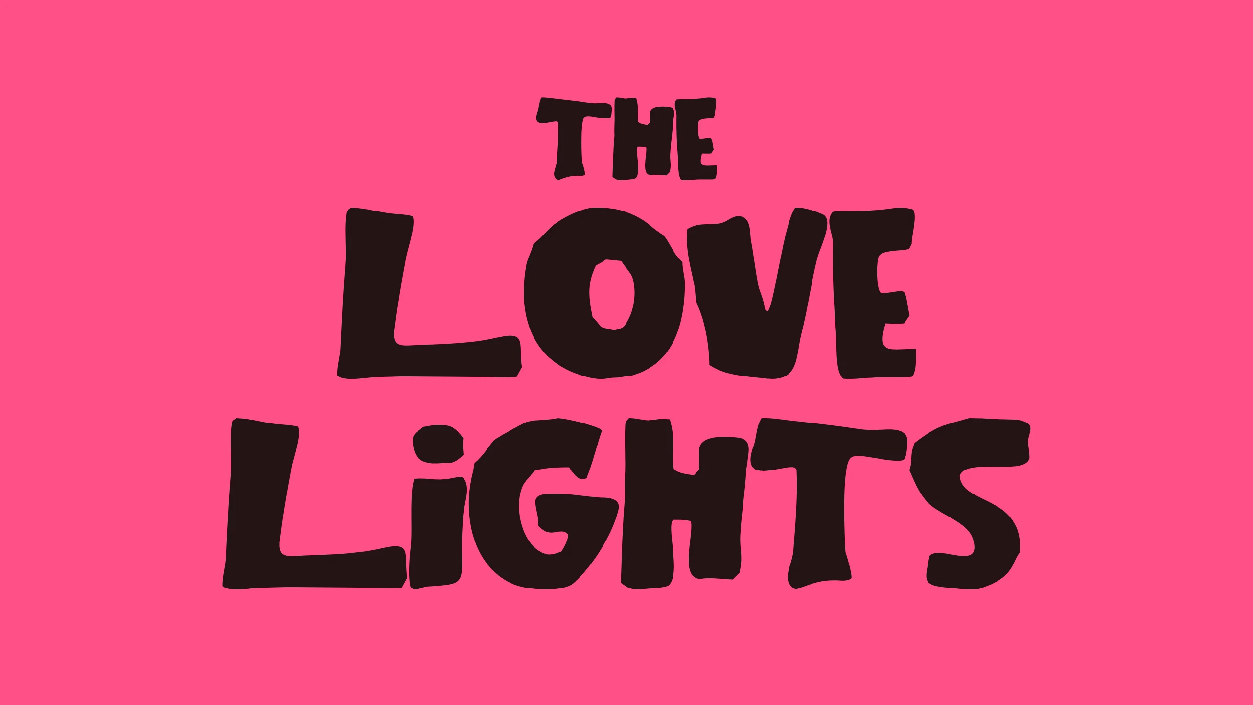
The Love Lights

[The Love Lights · 2026]

The lettering in The Love Lights wordmark came from a vintage alphabet sheet. I traced the sheet and turned it into a typeface that installs like any other font, so the lettering can set any line, not only the name. Try it and download it ↗

THE LOVE LiGHTS set in the typeface with the dotted i, dark brown on Luminous Pink

Product brief

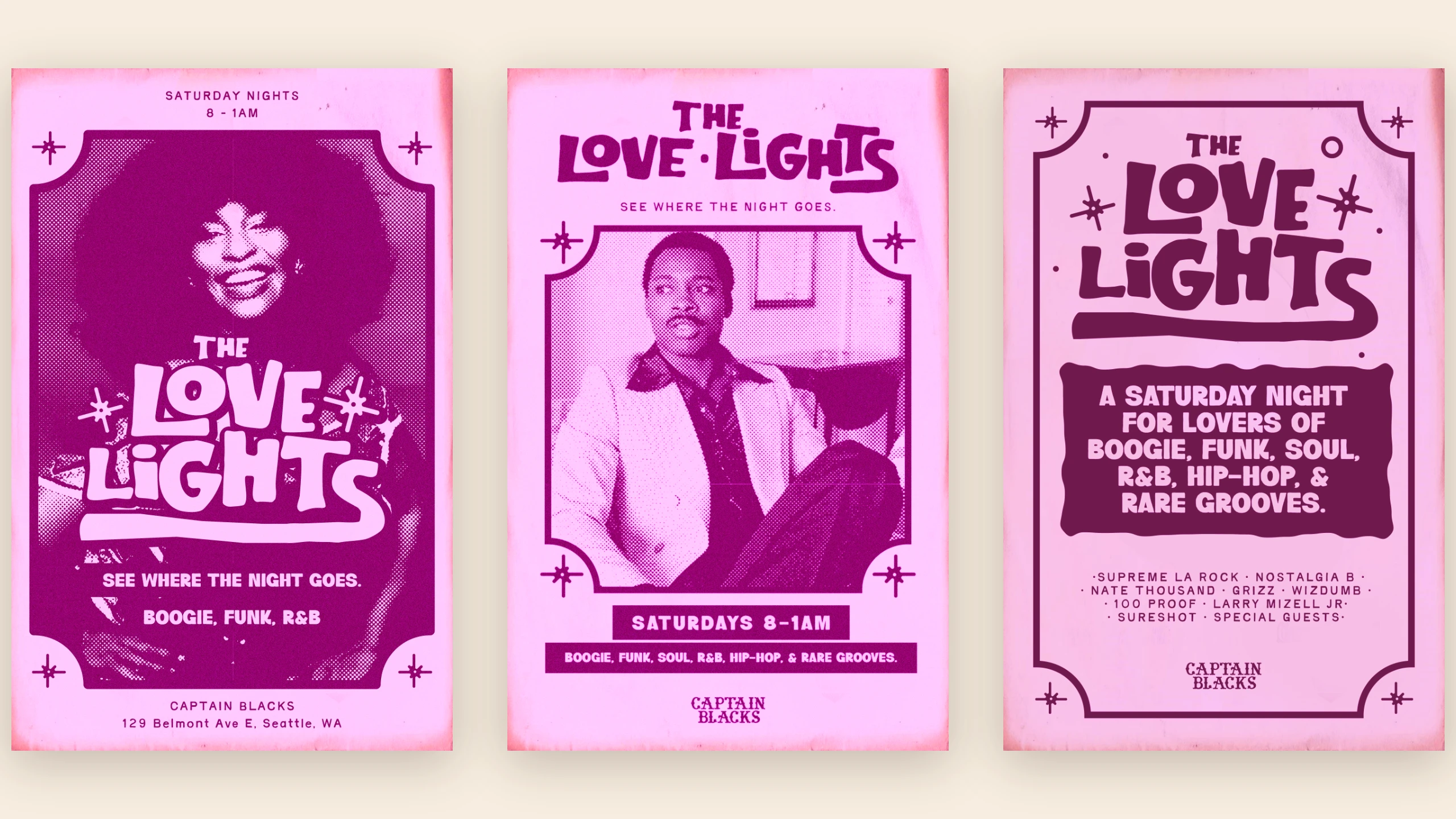
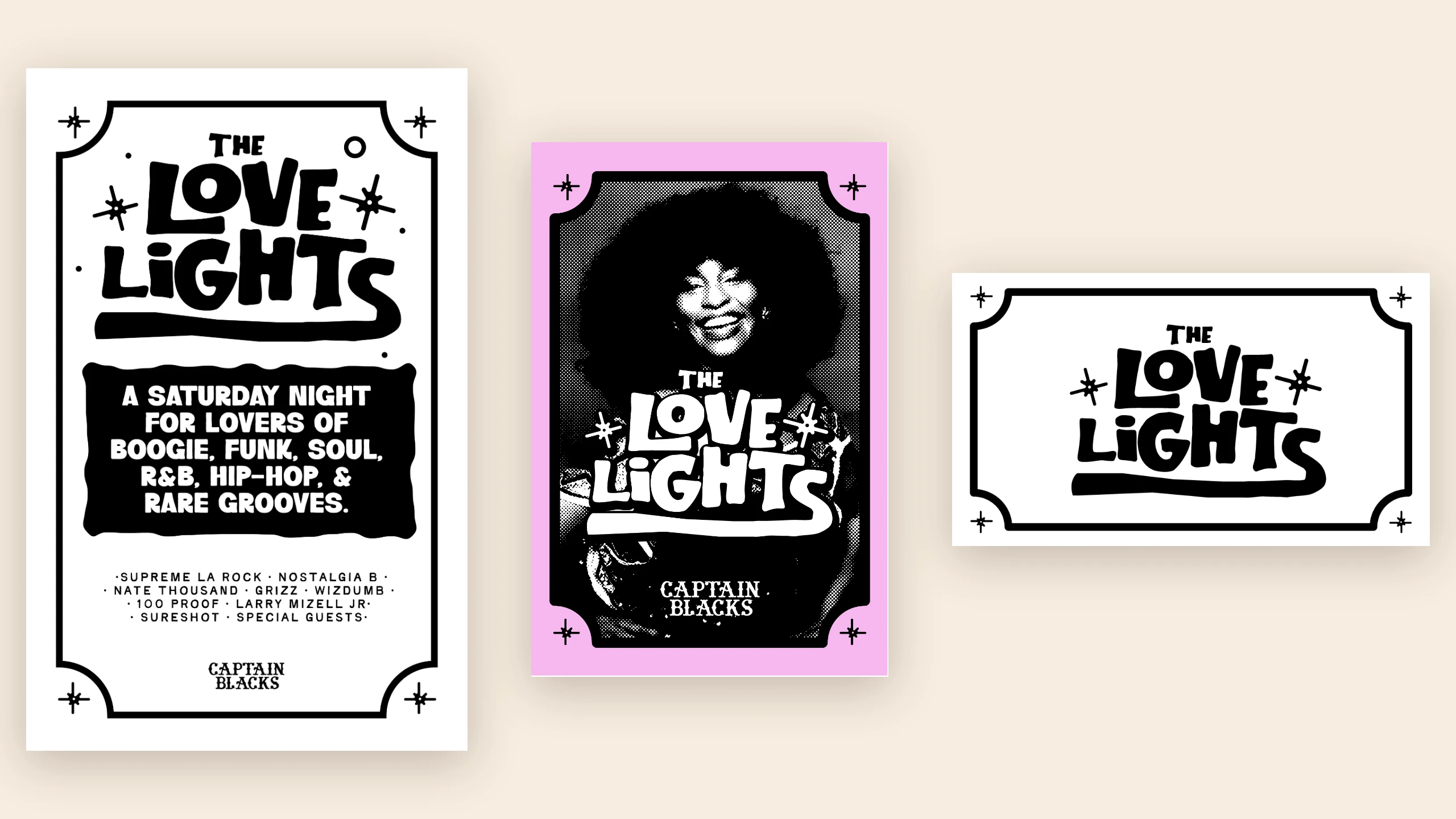
The Love Lights is a Saturday night at Captain Blacks on Capitol Hill for lovers of boogie, funk, soul, R&B, hip hop and rare grooves. Its brand line is "Find your people through music." The identity runs on posters, flyers, invite cards and social frames, and every one of them carries the same hand-cut wordmark.

That wordmark is lettering, not type. It could spell one name. The goal was to make the lettering usable as a font: install it, type in it, and set a date, a lineup or a headline in the same letters as the name.

The whole build, from 43 traced shapes to an installable OpenType font with alternates, numbers and punctuation, happened in one working session with an AI coding assistant. I set the direction and made every visual call; the assistant wrote the build scripts and proofed each step.
The solution

01  /  05 1

Found alphabet

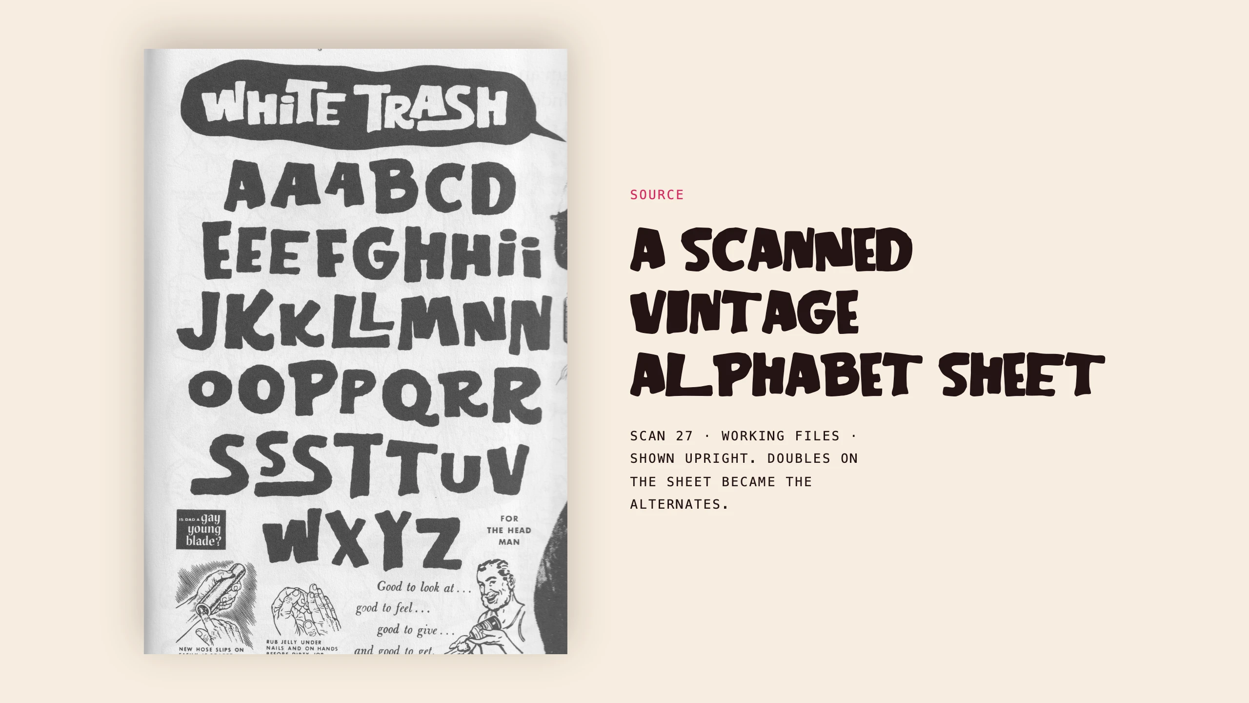
The source is a scanned vintage alphabet sheet in the project's archive, alongside the matchbook, pin-up and ad scans collected for the identity. The sheet draws some letters twice or three times: three As, three Es, three Ss, and two each of H, I, K, L, N, O, P, R and T. Those doubles are why the typeface has alternates at all.

The scanned vintage alphabet sheet, shown upright: AAABCD, EEEFGHHii, JKKLLMNN, OOPPQRR, SSSTTUV, WXYZ, with the doubled letters that became the alternates
02  /  05 2

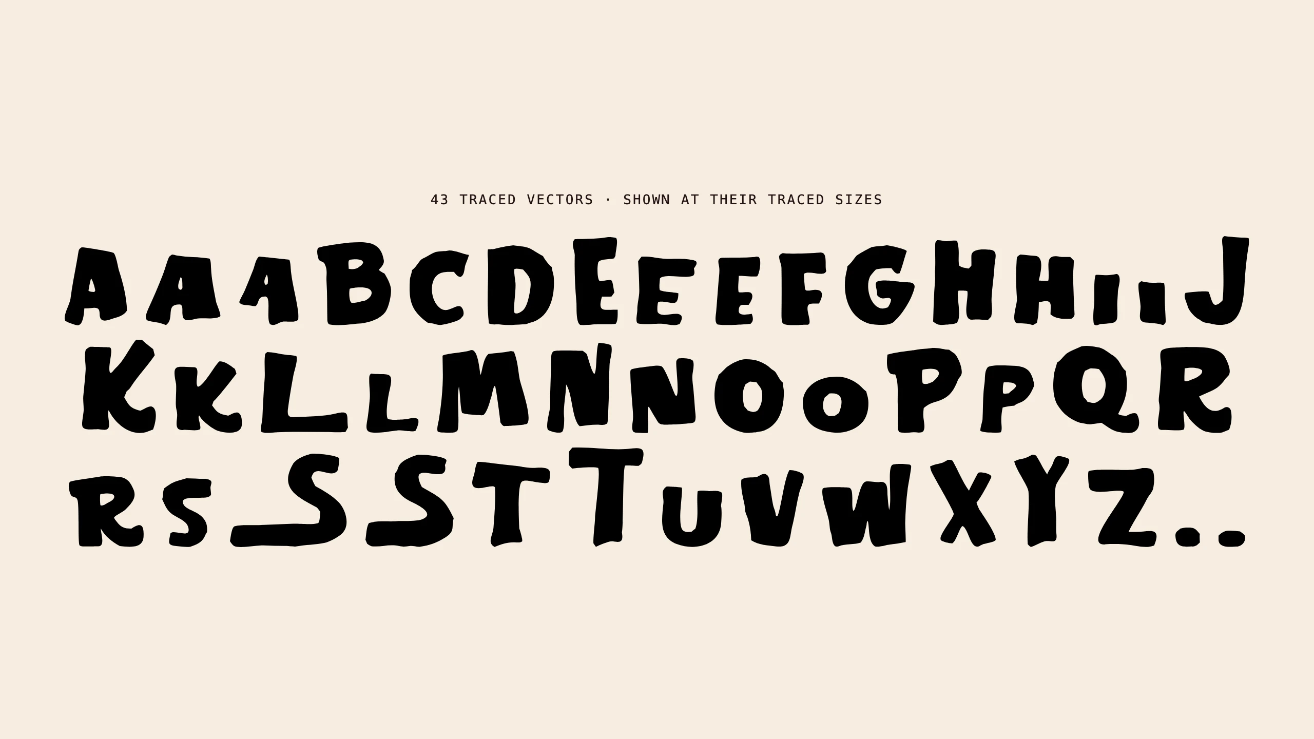
43 shapes

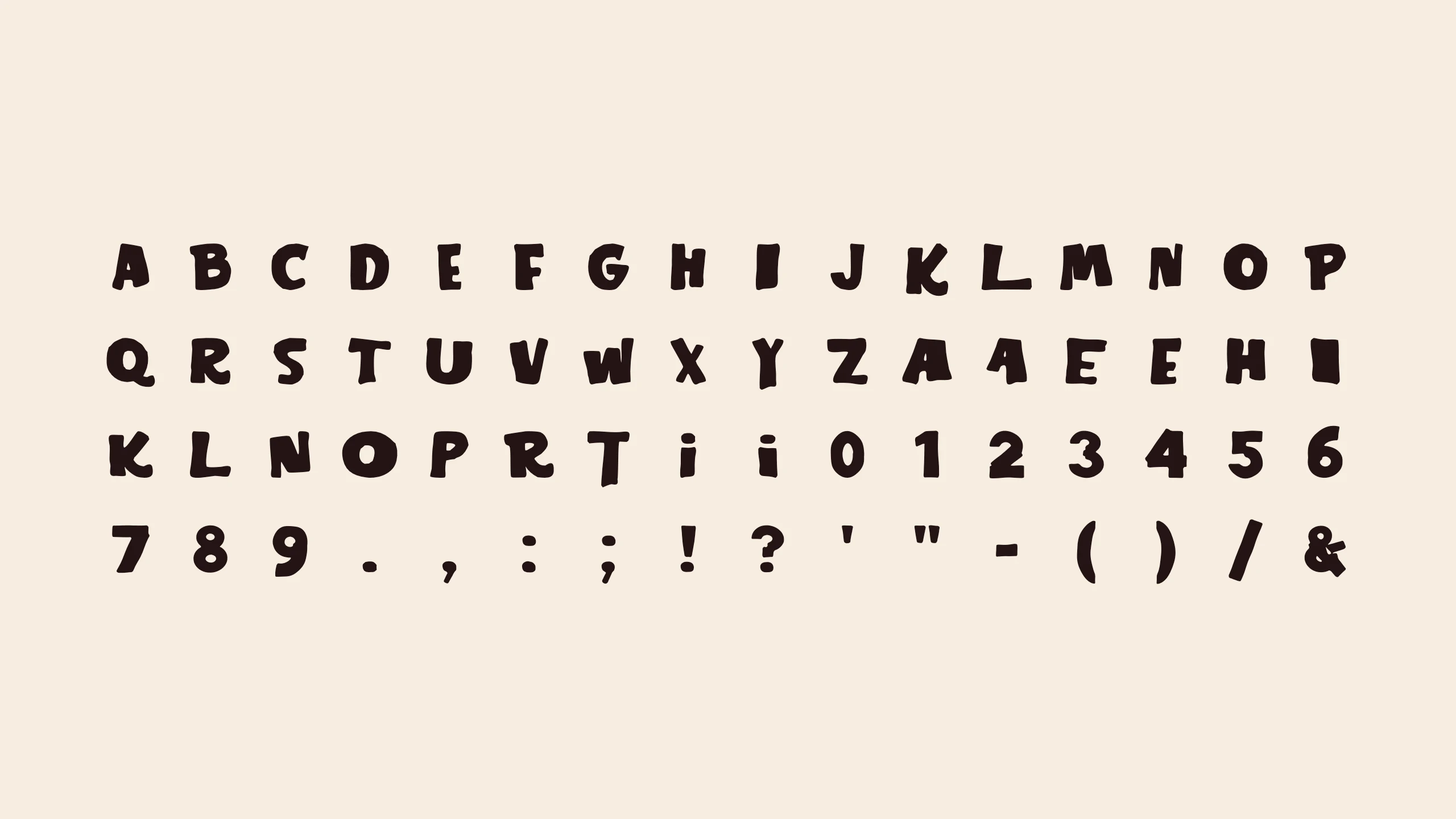
I traced the sheet into 43 vector shapes, exported as unnamed files. The first step of the build was identifying them: a contact sheet of every file, read by eye, mapped each shape to a letter. That gave 26 capitals, 13 alternates, two swash S shapes whose tails sweep back under the letters before them, and two dots. The dots belong to the sheet's small i, the same dotted i as in the LiGHTS wordmark.

All 43 traced vectors in alphabet order at the sizes they were traced, including doubled letters, two swash S shapes and two dots
03  /  05 3

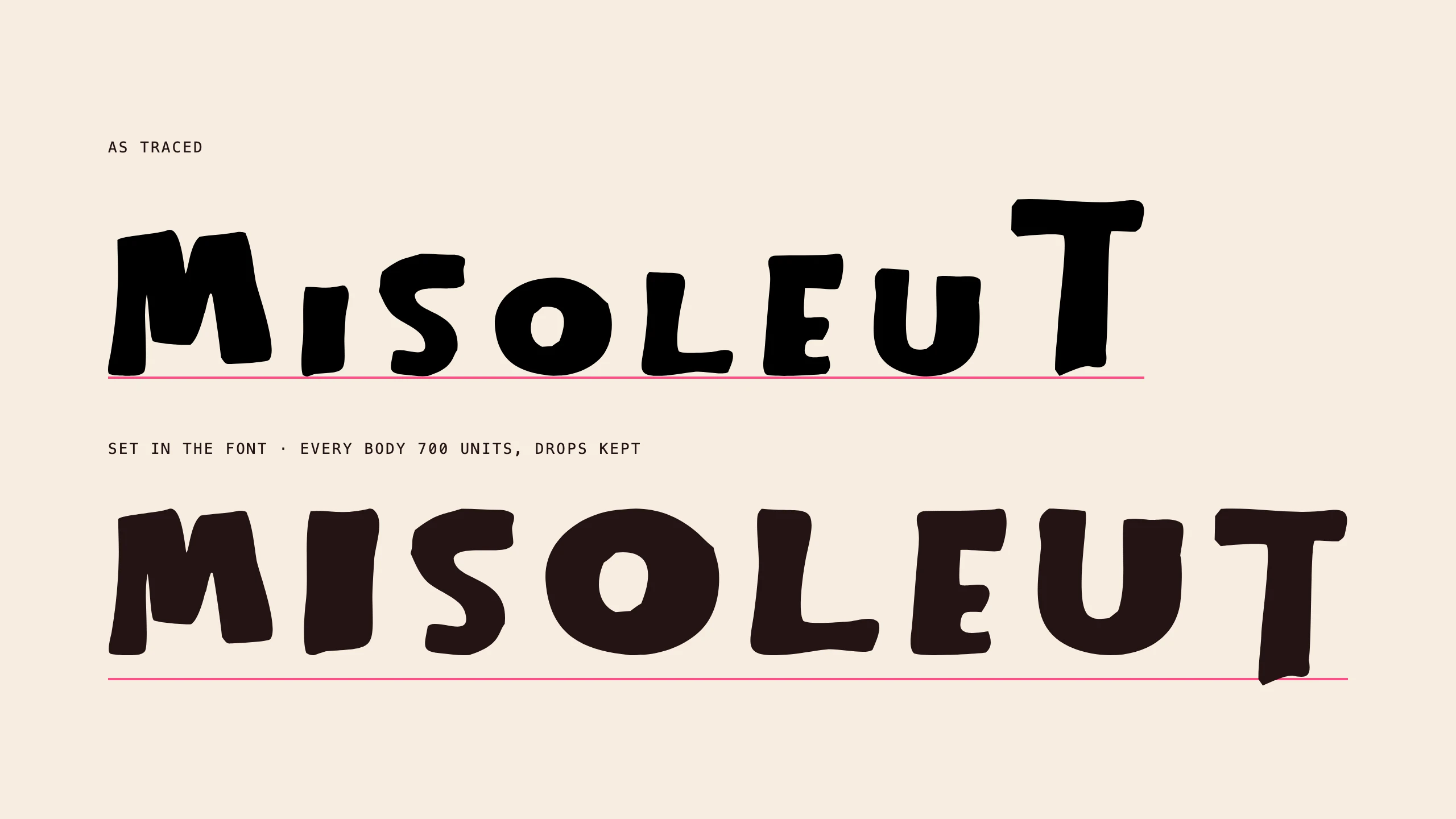
One cap height

The first build scaled every shape by one factor and sat each on the baseline. The proof showed why that fails: the I, the S and several alternates were drawn smaller on the sheet, so they sank in a line of text. Each shape is now scaled so its body hits one cap height, 700 units on a 1000 unit em, and the letters that are meant to hang below the line (the long T, Y, K's leg, Q's tail) keep their drop. The bounce stays in the outlines, not in the sizes.

Eight letters as traced, at uneven heights, above the same letters set in the font at one cap height, with the long T still dropping below the baseline
04  /  05 4

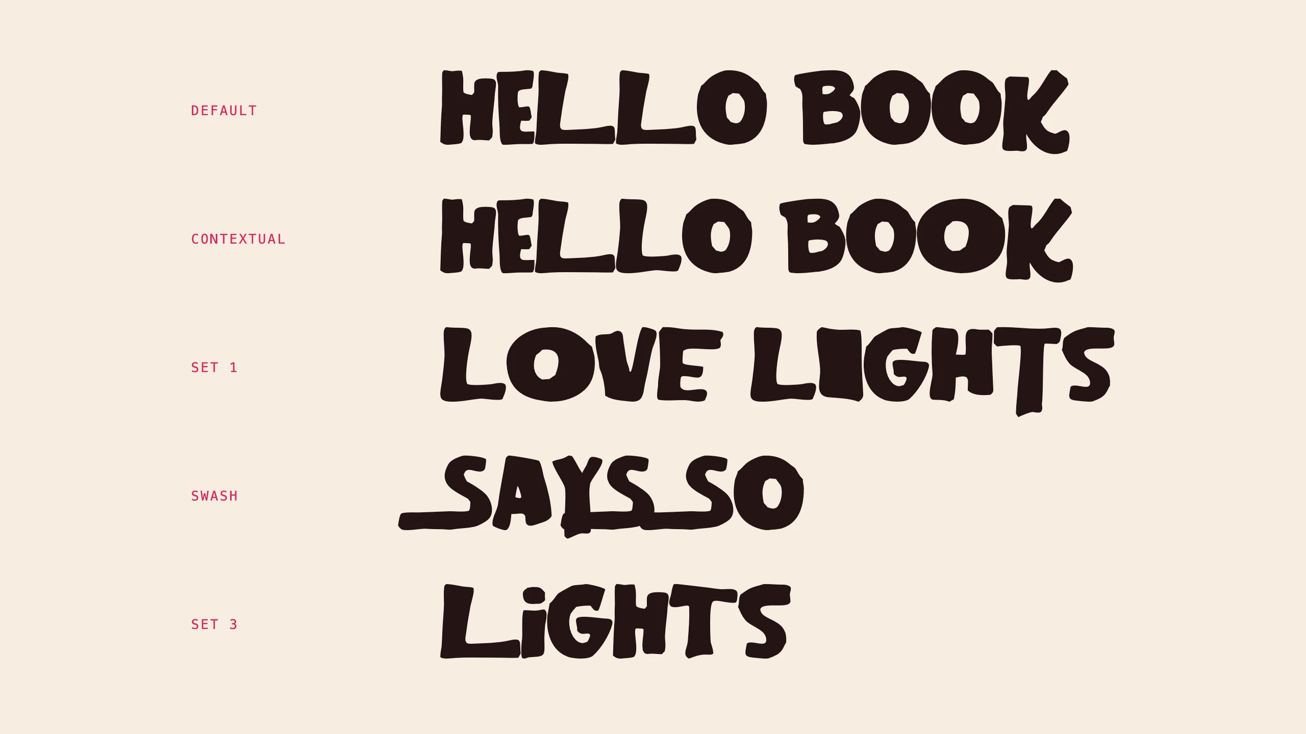
Alternates that behave

Hand-cut letters look fake when a double letter is two copies of one shape. Contextual alternates are on by default: when a letter repeats, as in the LL of HELLO or the OO of BOOK, the second one switches to its alternate. Stylistic set 1 swaps in every first alternate at once, set 2 the second A and E, and set 3 the dotted i from the wordmark, built from the sheet's short i stems and its hand-cut dots. A swash feature turns S into the swash S, and every alternate is also reachable one at a time from a design app's glyph panel.

HELLO BOOK with and without contextual alternates, LOVE LIGHTS in stylistic set 1, SAYS SO with the swash S, and LiGHTS with the dotted i from stylistic set 3
05  /  05 5

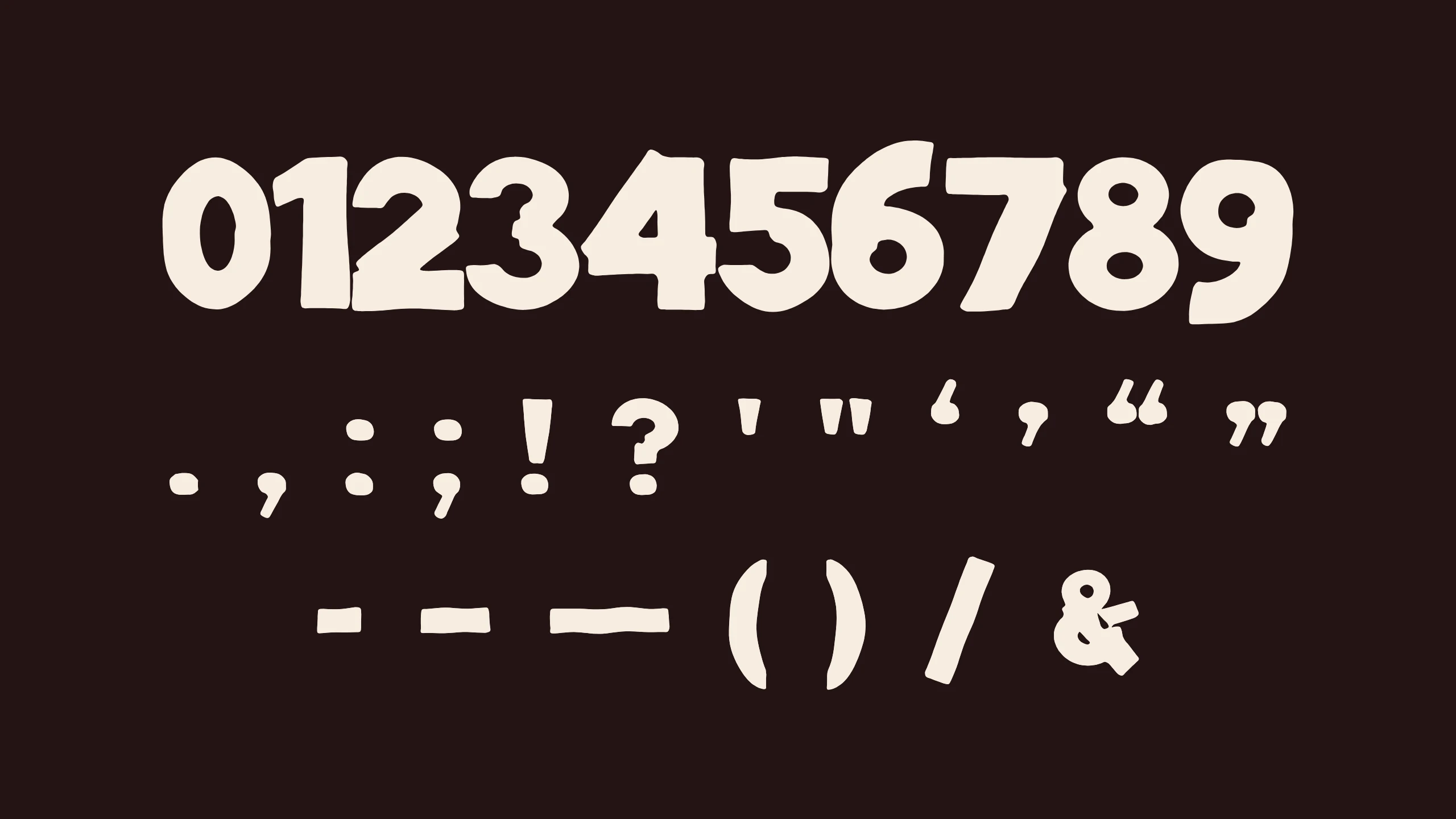
Numbers and punctuation

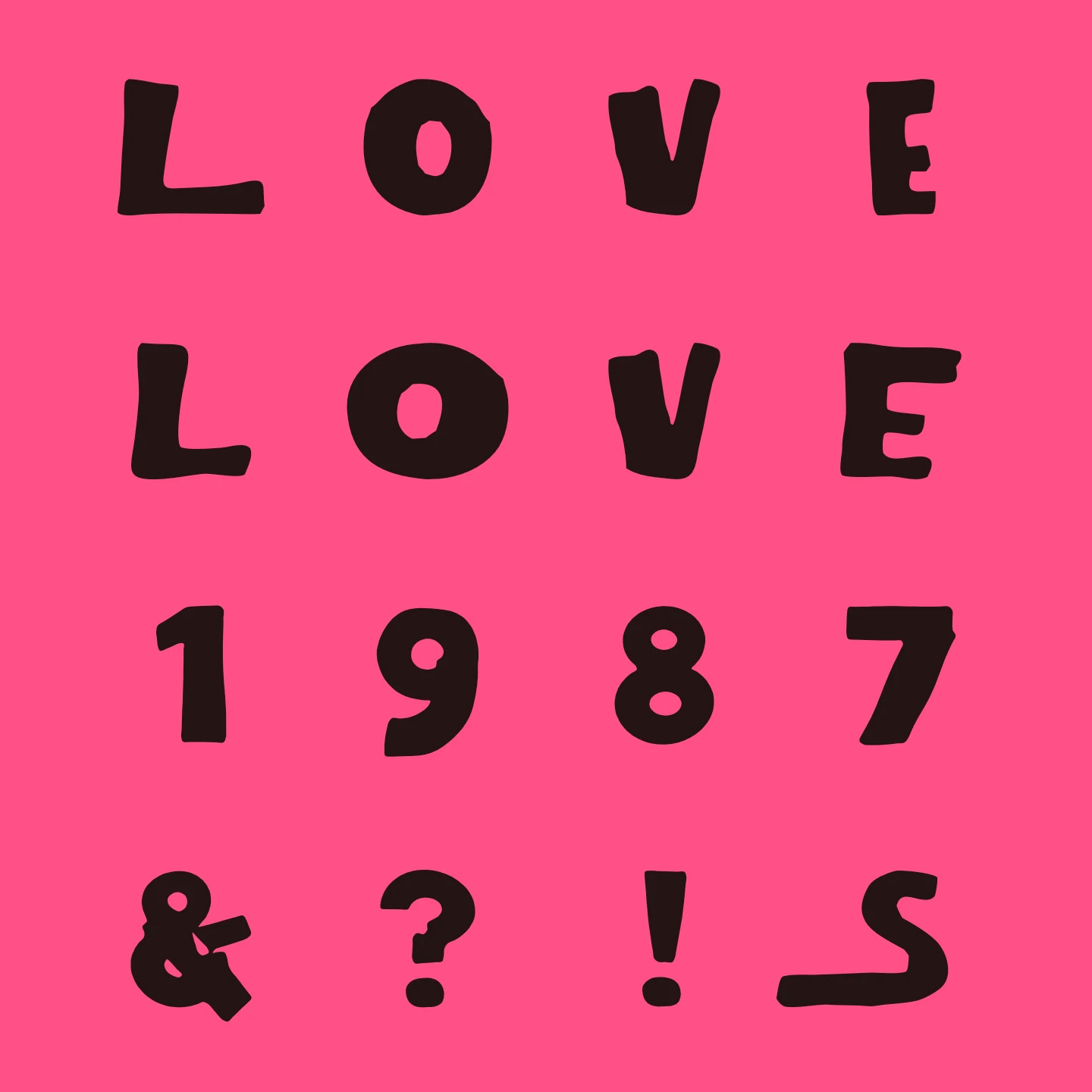
The sheet has no numbers and no punctuation, and a night needs both: dates, times, a lineup. The 28 missing characters were drawn to match. The letters were measured first (vertical stems 200 to 270 units, horizontal bars 150 to 210, tiny counters), each new character was built from solid parts at that weight, and a pass over the outline rounded the corners and gave the edges a gentle, uneven wobble. The dots in the colon, semicolon, exclamation and question marks are the sheet's own hand-cut dot.

The ten numbers and the punctuation added to match the alphabet, in cream on dark brown

Hand-cut lettering,
made typeable.

By the numbers

LOVE set twice, default and alternates, over 1987 and & ? ! S, on pink

43

traced shapes from one scanned alphabet sheet

75

glyphs: 26 capitals, 17 alternates and swashes, 10 numbers, 20 punctuation marks, and the space

7

OpenType features: contextual alternates, three stylistic sets, stylistic alternates, swash, access all alternates

My role

I found the alphabet, traced it, and directed the build: which shape is each letter, which of the doubles is the default, how tight the spacing sits, and when a generated character matched the hand-cut ones and when it did not. The build scripts, the proofing renders and the matching numbers and punctuation were produced with an AI coding assistant working from those calls.

Role

Designer, Art Director

Timeframe

August to September 2026

Disciplines

Type Design, Brand Identity, AI-Assisted Production

Current state

Version 1.000, built and proofed. It installs as a standard OpenType font on Mac and Windows, and ships as WOFF2 for the web. Both are free to download from the live type tester. It has not yet been used on a released Love Lights piece; the posters, flyers and invites below carry the hand-lettered wordmark it came from.

Formats

OpenType (.otf), WOFF2

Built with

Python, fontTools, skia-pathops, HarfBuzz for proofing

Source files

One SVG per character, rebuilt into the font by script

Problems & decisions

Keep what makes the lettering hand-cut, remove what makes it fail as type.

The wordmark is the most recognisable thing in the identity, and it can say only one thing. Every other line on a poster (the night, the genres, the lineup, the address) is set in something else. A set of loose vector letters does not fix that either: spacing them by hand, piece by piece, for every line is slow and never consistent. The lettering needed to become a font.

Hand-cut letters are uneven on purpose, but the unevenness on the sheet came in two kinds. The outlines wobble, lean and flare, and that is the character. The sizes vary because some letters were simply drawn smaller, and in a line of text that reads as a mistake. Every shape is scaled to one cap height and nothing else about it is touched: no smoothing, no straightening, no redrawn curves.

The first build gave each letter a modest side bearing. On the proof it read like loose letters rather than a cut-paper headline, so the space on each side of a letter came down from 18 units to 4. Letters now sit close to touching without overlapping, which is how the wordmark sits too. There is no kerning table yet; see the limitations below.

Numbers and punctuation had to look cut by the same hand. They are generated by a script rather than drawn freehand so they can be rebuilt and adjusted, and each one is saved as its own SVG next to the traced letters so it can be opened and redrawn in a design app. The first pass came out too rough: the edge wobble was stronger than anything on the sheet and the numbers looked jagged next to the letters. The wobble was cut to a few units over long wavelengths, and the hand-cut dot from the sheet replaced the generated dots.

  • Source of truth is two folders of SVGs: the 43 traced shapes and the 28 generated characters. One build script reads both, scales and places each shape, sets spacing, writes the OpenType features and outputs the .otf and .woff2. Change a shape, rerun, and the font follows.
  • A second script generates the numbers and punctuation: rings, bars and tapered strokes merged with skia-pathops, then an outline pass that rounds corners and adds the edge wobble.
  • Every step was proofed by shaping test lines with HarfBuzz, the same text engine browsers use, so the alternates, contextual swaps and swashes were checked as they actually behave, not as they were meant to.
  • The size comparison, specimens and character set on this page are rendered from the finished font in a headless browser, not mocked up.

The letterforms come from a found vintage sheet whose original maker and rights are unknown, It is offered as a free download for now; if the sheet's origin turns up, its terms decide what happens next. It is all capitals: lowercase keys type the same capitals. There is no kerning, so pairs like AV and LT can sit loose. Of the generated characters, the ampersand is the weakest, with an upper loop that reads as detached, and the 3 has a small notch where its bowls meet. The font has been proofed in a text engine and a browser but not yet tested in design applications.